Mike ‘Doc’ Emrick announced his retirement on Monday and for some reason I felt sadness overcome me. Selfishly of course.
This is obviously a time for happiness for him and his family. The former NHL play-by-play announcer for NBC Sports announced more than 3,750 games. He covered the NHL for 50 years and no doubt deserves to go out when and how he wants.
This is more of me being sad that a titan of the game, a friendly and familiar voice will no longer be on the call. I have grown accustomed to listeninging to him. No matter how slow the game was, I would never get bored with how he could frame what was happening on the ice. He could make the most mundane event interesting.
What I like about Doc the most is that he seems very down to Earth. He reminds me of Fred Rogers of Mister Rogers’ Neighborhood. He’s well-prepared and he doesn’t take himself too seriously. He doesn’t make himself the center of attention and he is genuinely curious about other people.
One of my fondest memories of Doc is when he came back to Bowling Green to call a hockey game. Emrick received his Ph.D. in broadcast communications from BGSU in 1976.
That evening he shared broadcasting duties with student radio voice of the Falcons, Evan Pivnick. Doc called the game effortlessly like he had been calling Falcon games for years.
Thanks for the memories, Doc. Best wishes on your retirement!#NCAAHockey pic.twitter.com/1nRpofpT7x
— NCAA Ice Hockey (@NCAAIceHockey) October 19, 2020
Pivnick, now the Director of Communications and radio broadcaster for the Adirondack Thunder of the ECHL shared a few memories of the game with Emrick.
BG only decided to give me a monitor in the booth because Doc was calling the game, too. And I don’t really blame them. You go above and beyond for a legend, not for a kid who doesn’t yet know how to stop his voice from cracking on air. pic.twitter.com/6TTf6wCBsH
— Evan Pivnick (@EvanPivnickADK) October 19, 2020
Here are Mike "Doc" Emrick's final @BGFalconHockey goal calls from back in 2017 during the 50th Anniversary of Slater Family Ice Arena. His impact on the game will never be forgotten. Thank you, Doc! pic.twitter.com/V5PTHN2Nu4
— EVERYTHING COLLEGE HOCKEY (@TeamECH) October 19, 2020
While I will miss him calling a game one bright spot is that retirement gives opportunities for the next generation of voices to call games.
I look forward to the next generation which includes Pivnick and another BGSU alumnus Everett Fitzhugh who will be broadcasting for the Seattle Kracken.
What a huge honor being on @NHLNetwork to talk @NHLSeattle_ & the excitement for the team as we inch closer to next fall! Also, it was great to talk to fellow @BGFalconHockey alum @mike_p_johnson, & outnumber @JamieHersch in the process! Maybe we can make her an honorary Falcon! https://t.co/XzTDlwaSfN
— Everett Fitzhugh (@TheVoiceFitz) October 14, 2020
Logo Talk:
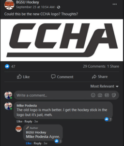
The CCHA returns Oct. 2021 and with it a new logo.
The league is retiring its old logo that featured blue block letters and a hockey player. It is transitioning to a more simplistic design. I’m not one to get too sentimental over a logo but I will miss the old design. I figured if anything they would spruce it up a bit.

From the press release
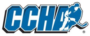
The new CCHA logo is a bold, distinctive interpretation of each of the CCHA letter forms, underlined by a hockey stick using Red and Blue colors, a classic hockey palette. The logo was designed by Bosack & Co., one of the country’s leading college branding firms.
The new CCHA logo is also available in each member school’s own colors, which offers an opportunity for the institutions to further embrace the relationship between the CCHA and each school’s hockey program.
“Today we made another historic step in the branding of the CCHA” stated Commissioner Don Lucia. “It is a very exciting time as we prepare to begin play in 2021, and we appreciate all of the work Joe Bosack and his team did to create the visual identity for our new league.”
“It was exciting to imagine the new brand identity that represents the mission and vision of the CCHA,” said Joe Bosack, founder and creative director at Bosack & Co. “We are thrilled with the results of our collaboration with Commissioner Lucia and the member schools.”
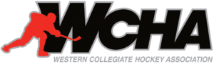
It appears when creating the old CCHA and the WCHA logos there was an emphasis that a hockey player needed to be included.
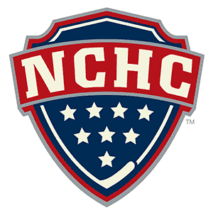
There must be a similar emphasis with new logos that a hockey stick needs to be included. The NCHC hockey stick looks awkwardly placed. Like we’re going to wedge one in there even if it doesn’t necessarily fit.
As for the CCHA logo I wasn’t a fan of it when a rendering was released a few weeks ago. I mean, how much more generic can you get than this? However, I’ve warmed up to it since the official release. Sure, it’s still not the best but the color scheme adds a lot to it and makes it pop. To be honest, does it really even matter what the logo looks like? It’s going to be a small patch on the uniform that no one is going to really notice.In my opinion the team logos are more significant than a league logo.